Design Rationale
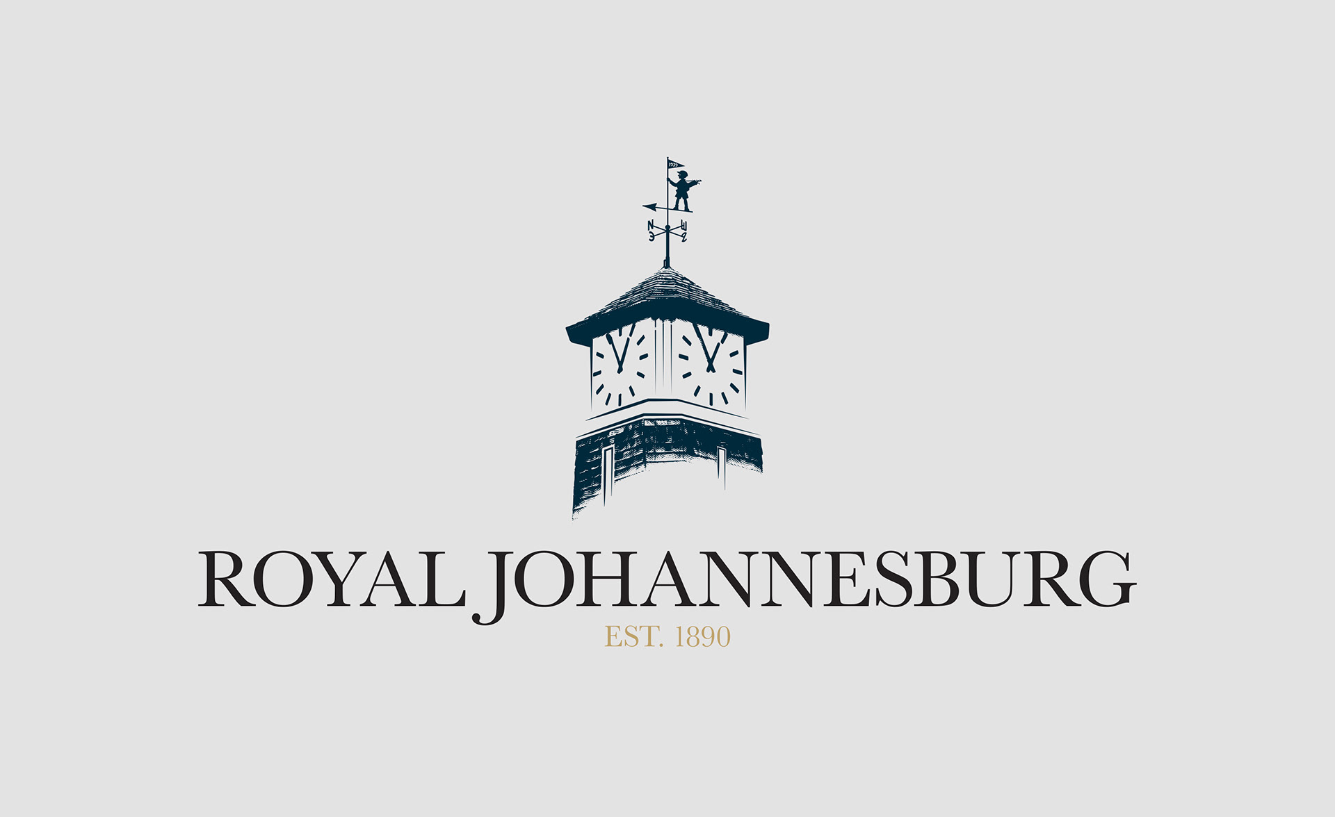
Redesigning the identity of an established golf club is an exercise in restraint. The goal was not to reinvent the brand, but to refine and strengthen it for modern use.
The Objective
Create a mark that:
• Respects the club’s heritage
• Improves clarity and balance
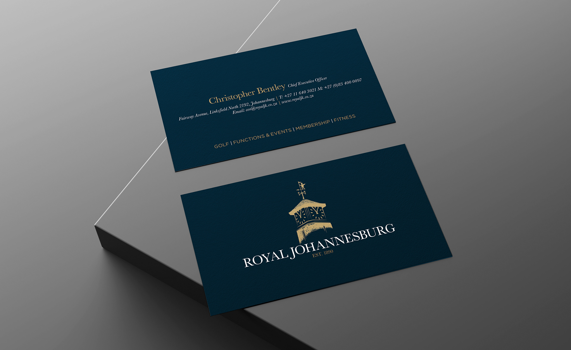
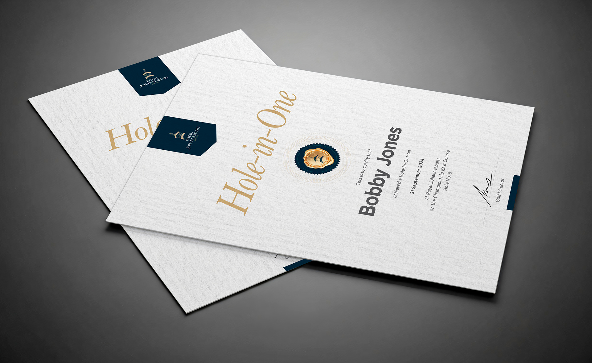
• Works seamlessly across print, digital and merchandise
• Feels timeless rather than trendy
The Approach
Refinement over reinvention
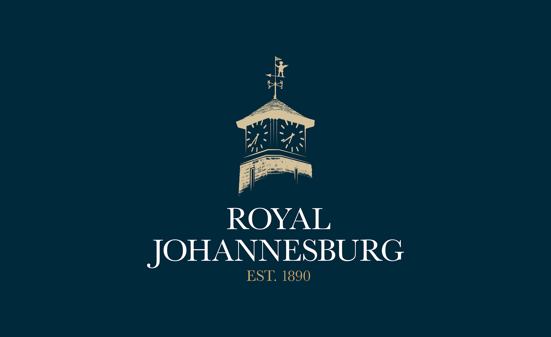
Recognisable heritage elements were retained, but reconstructed with improved geometry and proportion to create a stronger, more confident mark.
Recognisable heritage elements were retained, but reconstructed with improved geometry and proportion to create a stronger, more confident mark.
Simplification for scalability
Detailing was carefully reduced to ensure the logo reproduces cleanly, from small embroidery applications to large-format signage.
Detailing was carefully reduced to ensure the logo reproduces cleanly, from small embroidery applications to large-format signage.
Typography with authority
The wordmark was refined to enhance legibility and reinforce the club’s stature, while maintaining a classic, established feel.
The wordmark was refined to enhance legibility and reinforce the club’s stature, while maintaining a classic, established feel.
Colour & Application
The palette remains rooted in the club’s identity, but was standardised for consistency across:
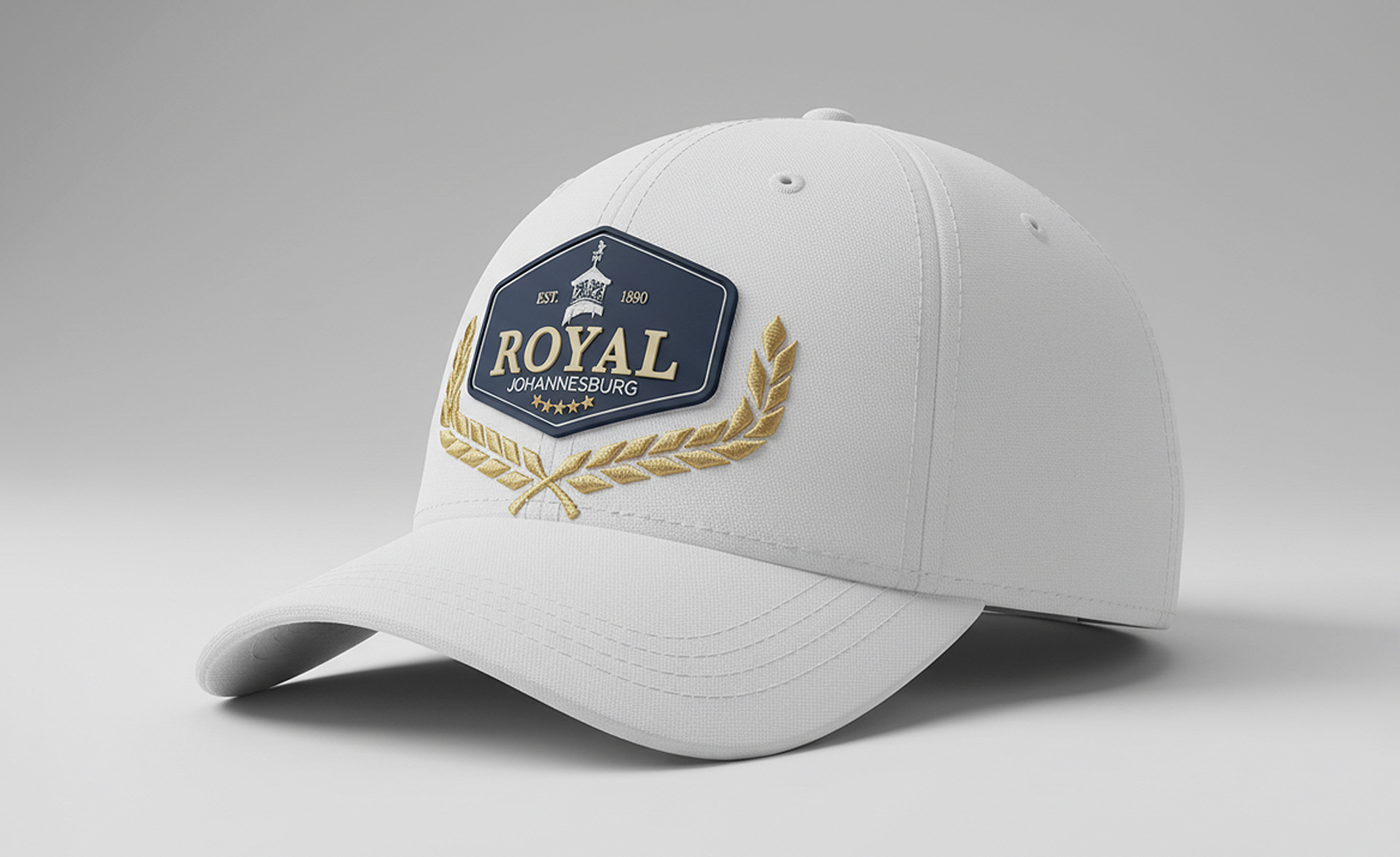
• Apparel and woven badges
• Golf balls and accessories
• Signage and wayfinding
• Print and digital platforms
Versatility was a key driver; the identity works in full colour, single colour, and premium finishes without losing impact.
The Result
A refined, balanced identity that honours the club’s legacy while positioning it confidently for the future.
Timeless. Recognisable. Functional.

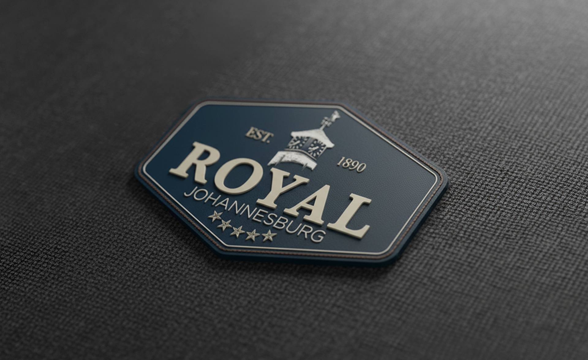
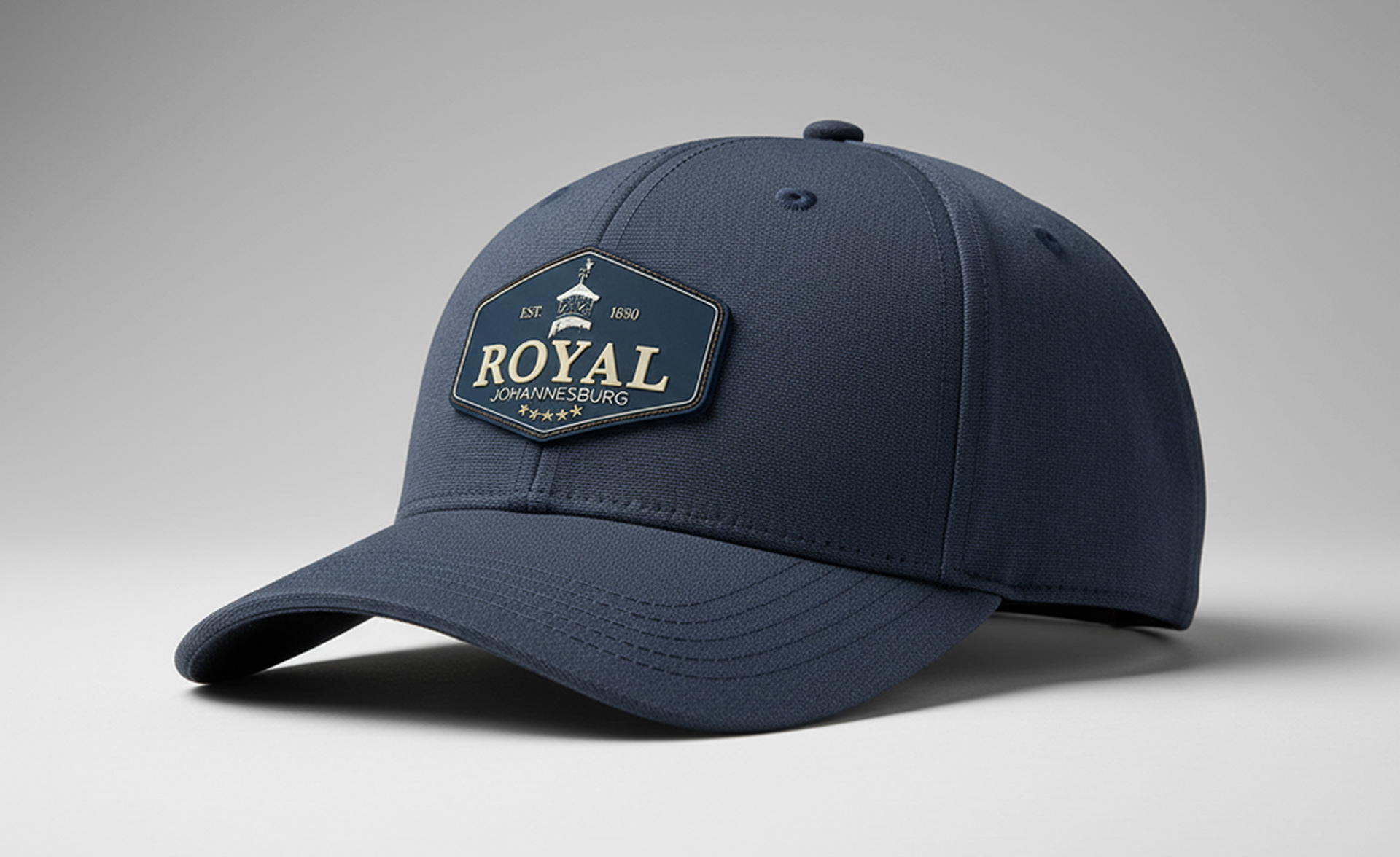
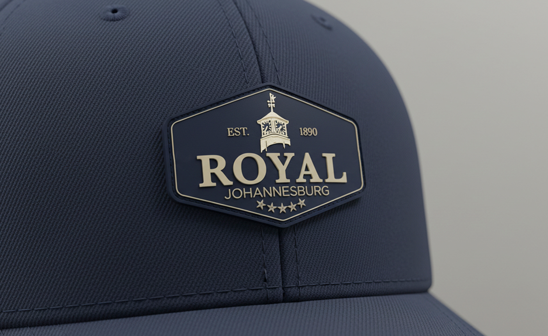
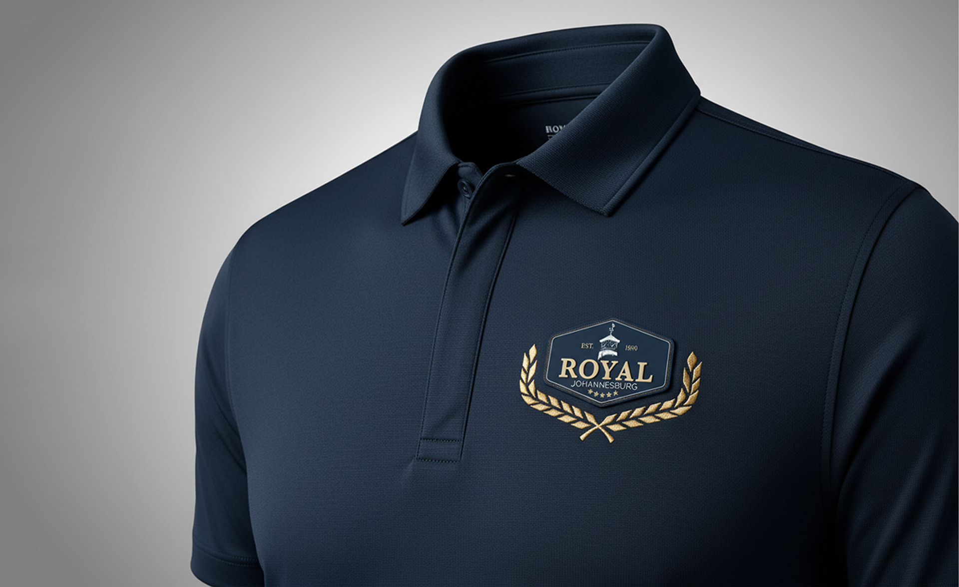
Below are a few apparel ideas with rubber badges and embroidery