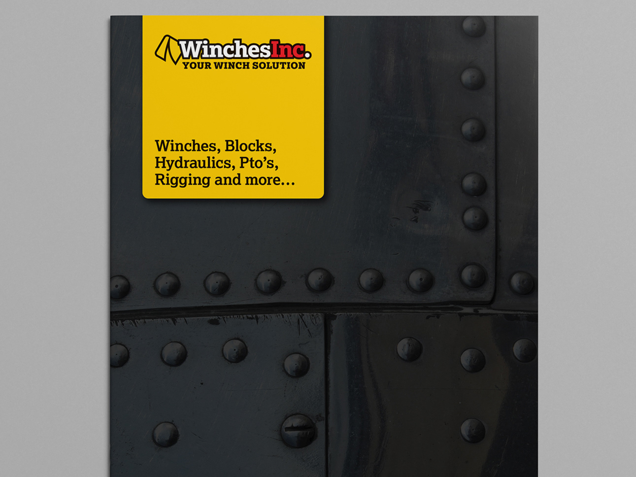
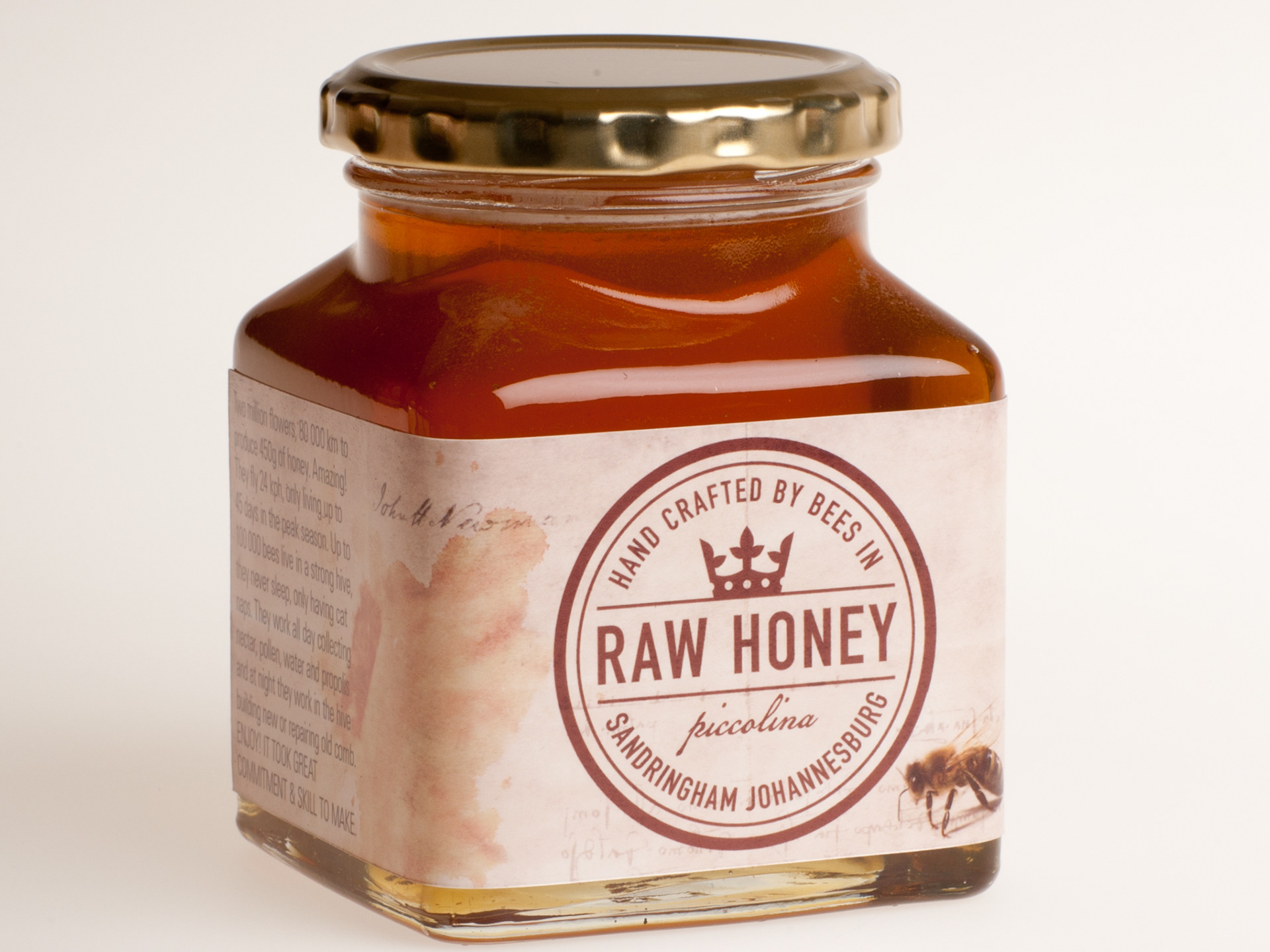
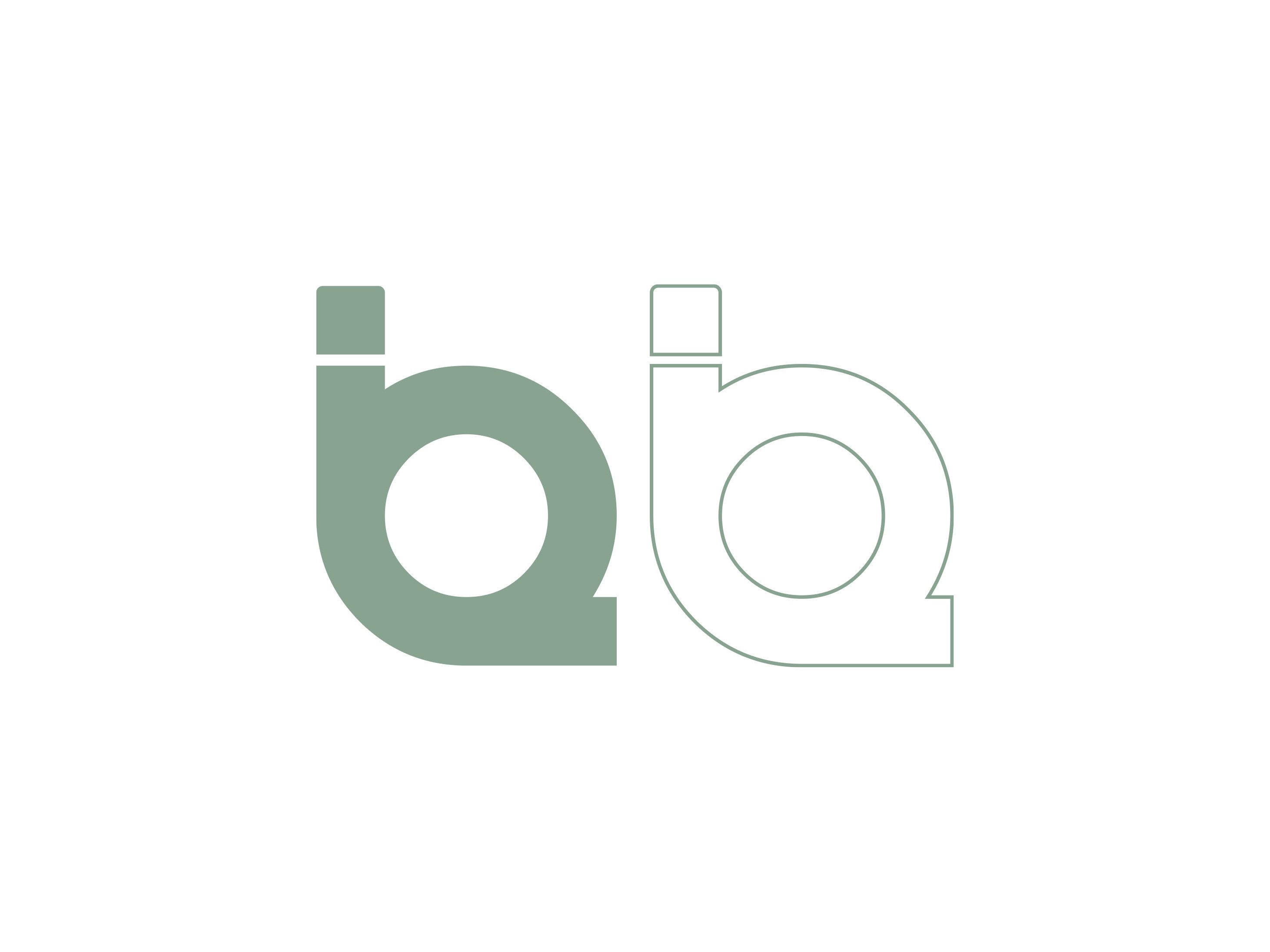
A corporate identity that challenged and pushed at every turn. The evolution of the logo turned out to be pretty tricky. The client wanted the 'crossing' represented visually; this posed a challenge, but I think the final result works pretty well. Overall a very clean and straightforward CI.